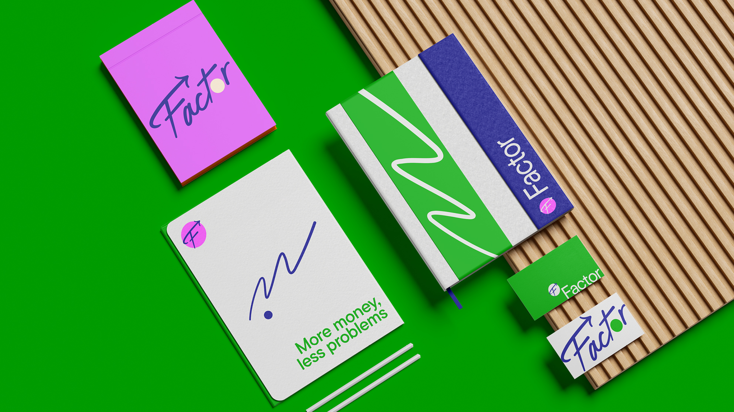
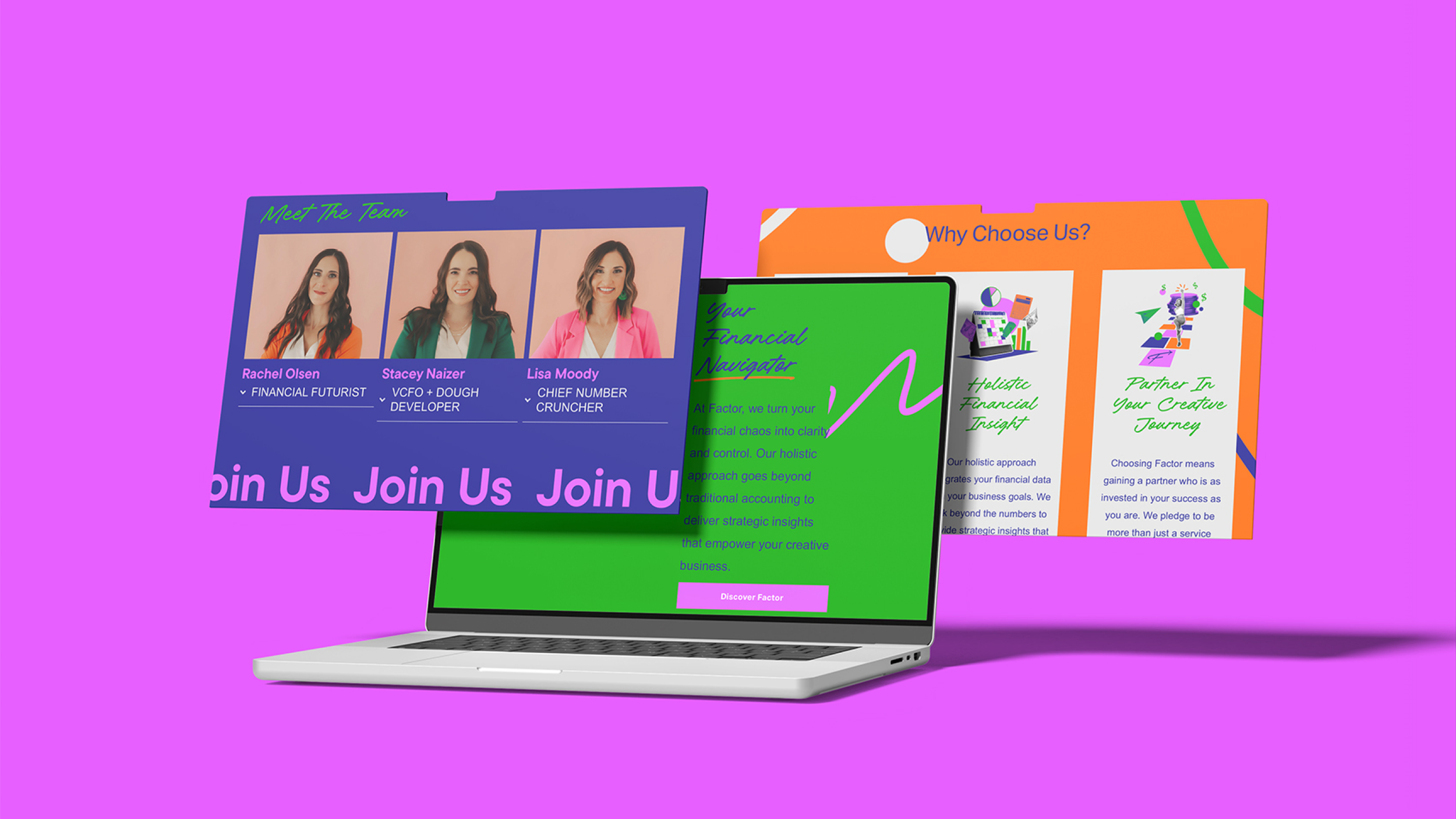
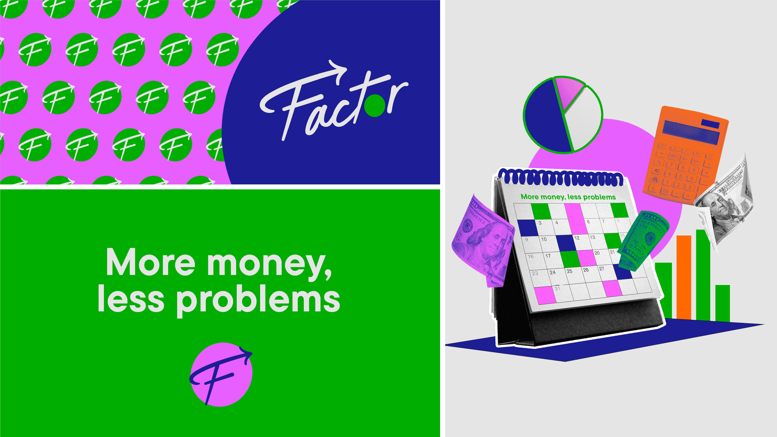
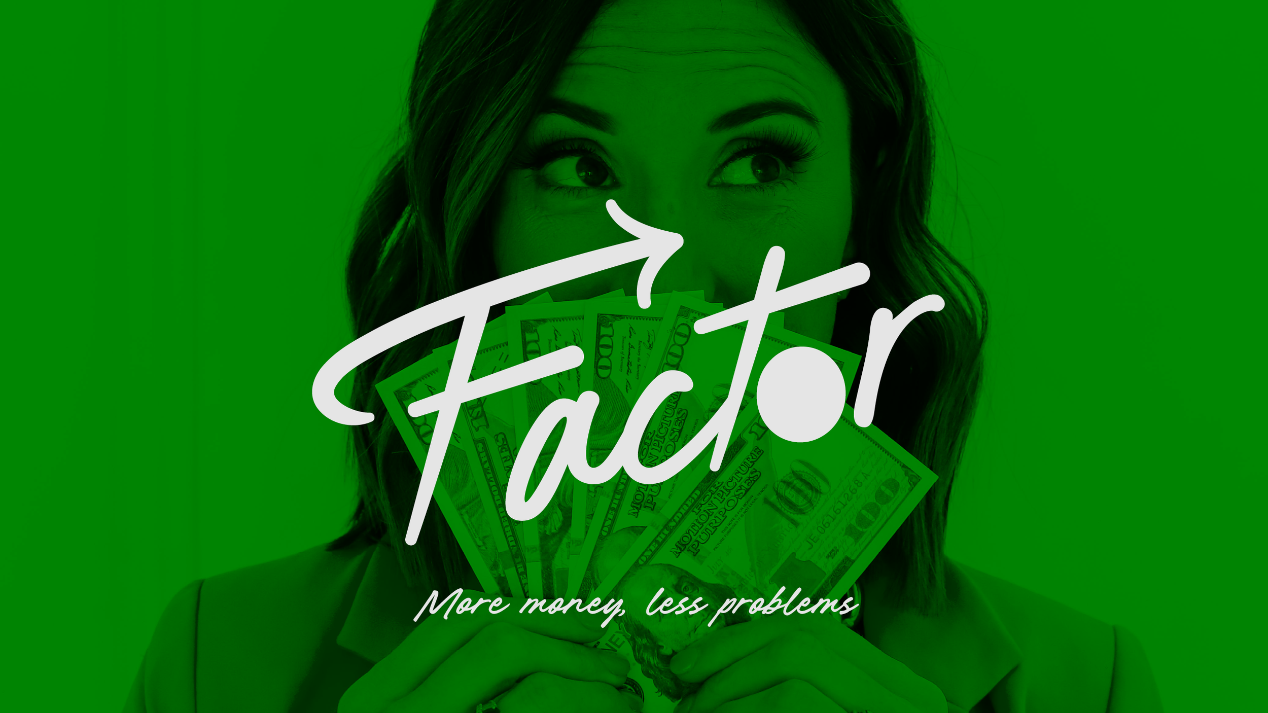
Factor
Making numbers sexy
Year
2024
Client
Factor
Service:
Brand Strategy | Naming | Visual Identity Refresh | Website Design
The Challenge
Siyo was operating under 2 identities: Zero Tolerance Coffee & Cafe and Siyo Cacao.
Internally, this created confusion.
Externally, it diluted trust.
Despite offering a high-quality, high-value product, the brand didn’t look or feel like who they truly were.
As the team put it:
“We had a high-quality product wearing a bathrobe and fuzzy slippers, looking for bud light at the gas station.”
The deeper issue?
An identity crisis.
Their Cherokee roots, veteran ownership, and bold attitude weren’t showing up consistently across all their touchpoints.
Our Approach — The Nuevo Method
We began by helping Siyo make a brave (and necessary) decision: one brand, one system, one clear story.
Our work focused on:
Brand consolidation
Folding Zero Tolerance and Siyo Cacao into a single, unified Siyo brandStrategic repositioning
Retaining the bold, no-nonsense attitude of Zero Tolerance while grounding it in the lore and storytelling traditions of Cherokee cultureCultural respect + functionality
Honoring existing Cherokee artwork while designing a system that worked in the real world (packaging costs, production realities, day-to-day use)System thinking
Creating clear building blocks the internal team could confidently follow
This was about revealing who Siyo already was and giving them tools to show up consistently.
The Risk
If left unresolved, the brand faced growing customer confusion, pricing resistance, and internal fatigue from managing multiple disconnected systems.

The Result
Siyo emerged with:
One cohesive brand system
Streamlined packaging across coffee and cacao
A visual identity that feels serious but cheeky, tribal yet elegant
Packaging that customers instantly connect with and trust
The rollout was a success!
Coffee packaging launched smoothly. Holiday chocolate boxes followed—and sold quickly. Even pricing friction disappeared.
“People don’t question the pricing anymore. It matches the quality.”
Most importantly, the team now has clarity, confidence, and a system that supports growth instead of slowing it down.
“Nuevo CARES.
They honored our identity, our needs, and our pain points with compassion and integrity.”
— Maura Baker